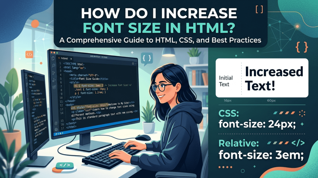
To change font size in HTML, use CSS. You add a rule that sets the font-size property. The rule can apply to headings, paragraphs, or any other element.
For example, place the following in a <style> tag or an external stylesheet:
h1 { font-size: 32px; }
{ font-size: 14px; }
You can choose other sizes as needed. Adjust the numbers until the text reads well on both phones and computers. This method lets you control how large each part of your page appears.
The Old Way: The Font Tag
Back in the early days of the web, people changed font size like this:
html
<font size=”5″>This text is bigger</font>
The size attribute went from 1 (smallest) to 7 (biggest). Default was 3.
This worked fine for years. But browsers stopped recommending it a long time ago. It still works in most browsers today, but you shouldn’t build new websites with it. It’s outdated and messy to maintain.
Learn it so you recognize it in old code. Don’t use it in new projects.
The Modern Way: CSS
CSS stands for Cascading Style Sheets. It’s the language that controls how HTML looks. Font size is one of the things CSS handles well.
There are three places you can write CSS. Inside an HTML tag, in a style block at the top of your page, or in a separate CSS file. All three work. Each one suits a different situation.
Option 1: Inline CSS
You write this one right inside the HTML tag.
html
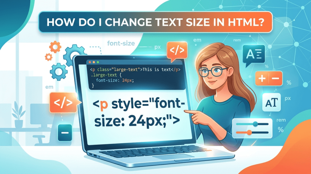
<p style=”font-size: 20px;”>This paragraph is 20 pixels tall.</p>
Good for one element. Not great if you have a lot of text to style. Imagine changing fifty paragraphs one by one. That’s why the next option exists.
Option 2: Add a Style Block to Your Page
This one goes in a style tag at the top of your HTML file.
html
<head> <style> p { font-size: 18px; } </style> </head>
Now every paragraph on that page uses 18px text. Change the number once and everything updates. Much faster than inline when you’re styling a whole page.
Option 3: Use a Separate CSS File
This one lives in its own .css file. Your HTML links to it.
In your HTML file:
html
<head> <link rel=”stylesheet” href=”styles.css”> </head>
In your styles.css file:
css
p { font-size: 16px; }
Most real websites do it this way. One file runs the look of every page. Change the font size once and the whole site updates.
Font Size Units Explained
When you set a font size in CSS, you pick a unit. The unit matters. Here are the main ones.
px (pixels) — Start here if you’re new to CSS. 16px is what browsers use by default. You set 20px, you get 20px. No surprises.
css
p { font-size: 20px; }
em — Depends on the parent element’s size. Parent is 16px and you write 2em? You get 32px. Use it when text needs to grow with whatever is around it.
css
p { font-size: 1.5em; }
rem — Like em but it looks at the root of the page, not the parent. Way easier to predict. Most developers grab this one for body text.
css
p { font-size: 1.2rem; }
% — Goes off the parent size. 100% is the same as the parent. 150% is one and a half times bigger.
css
p { font-size: 150%; }
vw — Goes off the screen width. 1vw is 1% of the screen. Wider screen means bigger text. Good for headings that need to fit any screen size.
css
h1 { font-size: 5vw; }
Changing Specific Elements
You can set a different size for each tag.
css
h1 { font-size: 40px; } h2 { font-size: 30px; } p { font-size: 16px; } small { font-size: 12px; }
Each tag gets its own size. Headings big, body text normal, small print tiny.
Using a Class
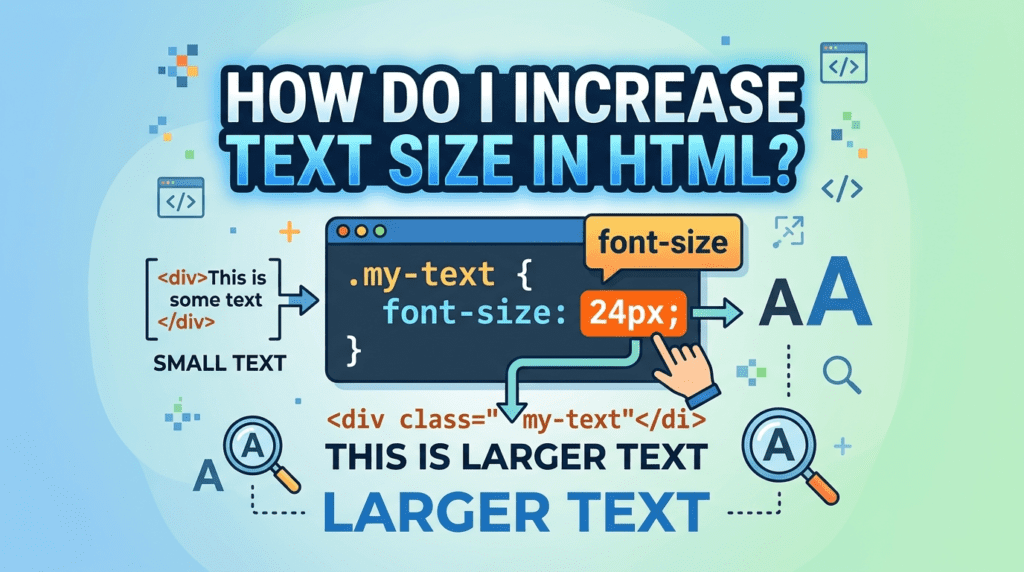
Sometimes you want one specific paragraph bigger than the rest. Classes let you do that.
Your CSS file:
css
.big-text { font-size: 24px; }
Your HTML file:
html
<p class=”big-text”>This one is bigger.</p> <p>This one is normal.</p>
Only that one paragraph gets bigger. The rest stay normal.
What Size Should You Use
For body text, 16px is the standard. Most browsers default to this and readers used to it. Going below 14px makes text hard to read on small screens.
For headings, anywhere from 24px to 60px depending on how big you want them. H1 should always be the biggest on the page.
If you’re building for mobile too, rem and vw units scale better than fixed pixels. A heading set at 40px looks fine on a desktop. On a phone screen it might be too big.
Conclusion
The font tag is old. Don’t use it for new work. CSS is the way to go. Inline for one element, internal for one page, external for a whole website. Pick px if you’re learning. Switch to rem when you get comfortable. Use vw for headings that need to scale with screen size. That covers everything you need to change font size in HTML.