Guides
How to Change Font Size in HTML (with CSS Examples)
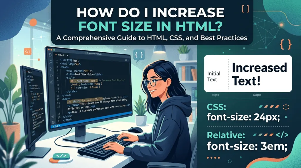
To change font size in HTML, you use CSS: the font-size property sets how big text appears. This guide shows the three places you can put that rule, explains the units (px, em, rem, %, vw and clamp()), and suggests sizes that stay readable on phones and desktops.
The old way: the <font> tag
Older tutorials use <font size="5">. That tag is obsolete in HTML5. It only offers sizes 1 to 7, mixes design into your content and is hard to maintain. Use CSS instead.
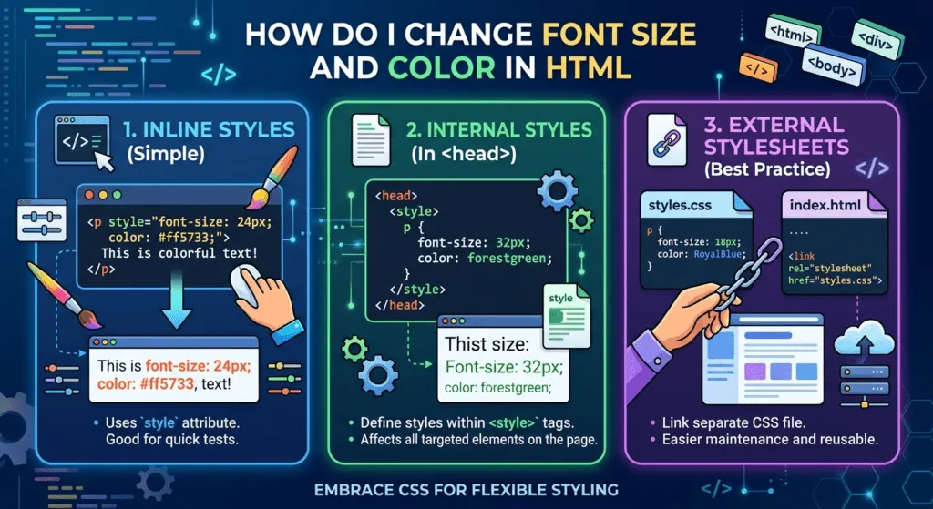
Option 1: inline CSS
Add a style attribute to one element. Quick for a single change:
<p style="font-size: 20px;">This paragraph is 20 pixels.</p>Option 2: a style block in the page
Put rules in a <style> element inside <head> to style every matching element on that page:
<style>
  p  { font-size: 1.125rem; }
  h1 { font-size: 2.5rem; }
</style>
Option 3: a separate CSS file
For a site with several pages, put your rules in one file and link it from each page, so you change sizes in one place:
<link rel="stylesheet" href="styles.css">

/* styles.css */
body { font-size: 1rem; }
h2   { font-size: 1.75rem; }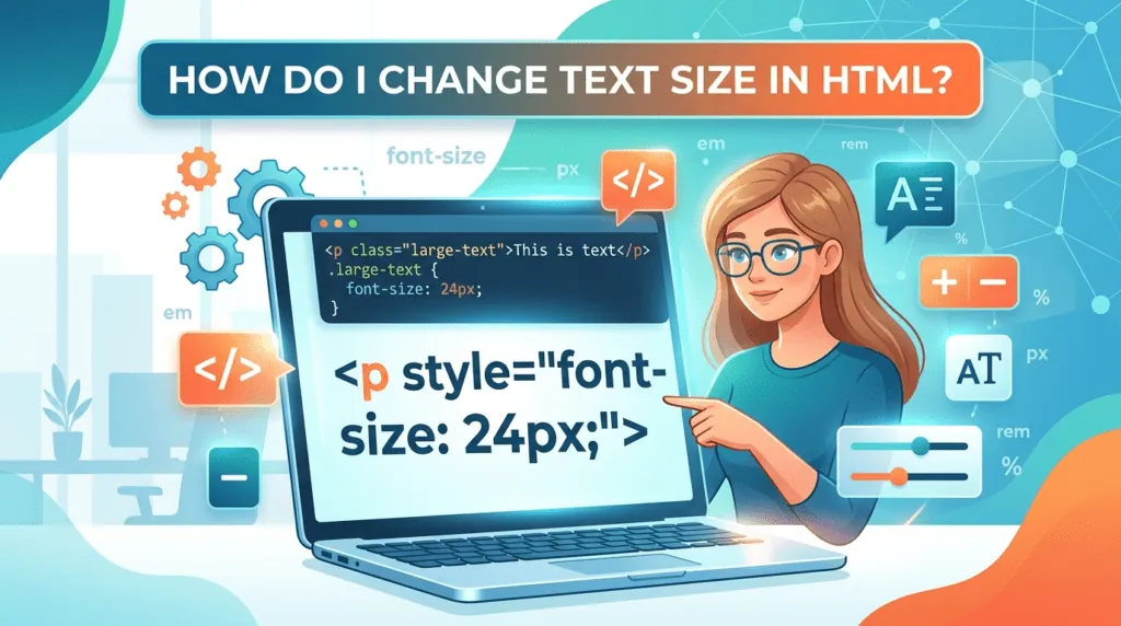
Font size units explained
| Unit | Means | Use it for |
|---|---|---|
px | Fixed pixels (browser default text is 16px) | Borders and fine details; avoid for body text |
rem | Multiple of the root (html) font size | Most text: scales with the reader's browser setting |
em | Multiple of the parent's font size | Parts that should scale with their container, like a button label |
% | Percentage of the parent's font size | Same as em (150% = 1.5em) |
vw | Percentage of the viewport width | Large display headings, always combined with a minimum |
Responsive font size with clamp()
clamp(min, preferred, max) lets a heading grow with the screen but never become too small or too big:
h1 { font-size: clamp(2rem, 5vw, 3.5rem); }Changing specific elements with a class
<p class="note">Small print</p>

.note { font-size: 0.875rem; }
Classes keep your HTML clean: change the rule once, and every element with that class updates.
Change font size with JavaScript
To change size in response to a button or setting, update the element's style:
document.querySelector('.article').style.fontSize = '1.25rem';For a site-wide "A+ / A−" control, change the root size instead, and every rem value scales with it:
document.documentElement.style.fontSize = '112.5%'; /* 18px if the default is 16px */Common font size mistakes
- Setting the root to a fixed pixel size (
html { font-size: 16px; }) overrides the reader's browser preference. Use a percentage or leave it alone. - Nesting em values: 1.2em inside 1.2em inside 1.2em compounds to 1.73em. Use rem when you don't want that.
- Blocking zoom: never add
maximum-scale=1oruser-scalable=noto the viewport tag; people with low vision rely on zooming. - Tiny text on mobile: anything below 16px in form inputs makes iPhones zoom in automatically when the field is tapped.
What font size should you use?
- Body text: at least 16px (1rem). Many sites use 17–18px for comfortable reading.
- Headings: roughly 1.5–2.5rem for H2 and H3, larger for H1.
- Small print: no smaller than about 0.875rem (14px).
- Line height: around 1.5 for body text makes long paragraphs easier to read.
Need decorative text for a social bio rather than a web page? CSS can't travel with copied text, so use Unicode styles from our font generator instead.
Frequently asked questions
Can I still use the <font size> tag?
It is obsolete in HTML5. Browsers may still display it, but it mixes style into content and can't use modern units. Use the CSS font-size property instead.
Should I use px or rem?
Use rem for most text. It scales with the reader's browser font setting, which matters for accessibility, while px stays fixed.
What is the default font size in browsers?
16px in all major browsers, unless the user changes it. That is why 1rem usually equals 16px.