Best Fonts for Your Instagram Bio: 10 Styles to Copy
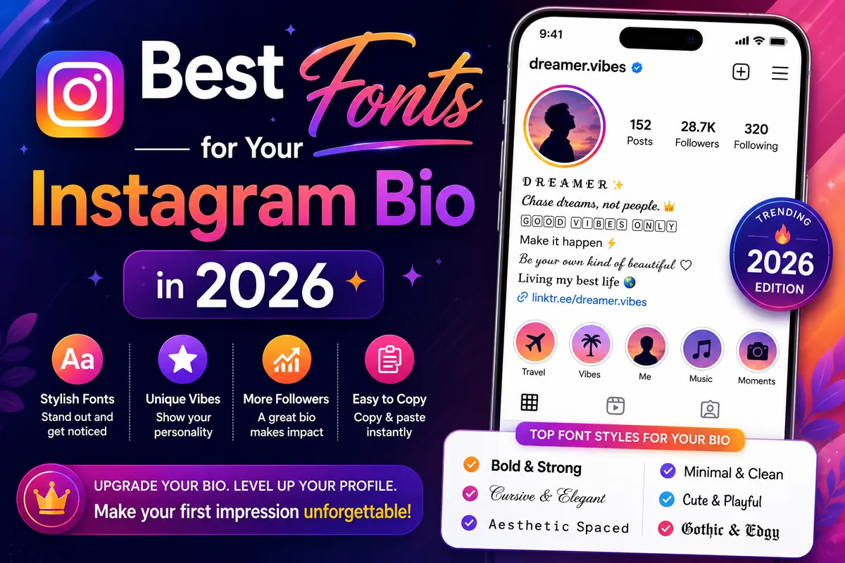
Your bio is the first thing people read on your profile, and the right style makes it memorable. This guide covers the best fonts for your Instagram bio: ten styles you can copy today, where each one reads best, and the small mistakes that make a styled bio hard to read. Instagram has no font menu, so every style here is made from Unicode characters you copy and paste.
How Instagram bio fonts work
Instagram shows every bio in the same typeface. Font generators get around this by swapping each letter for a look-alike Unicode character: 𝐁 is a "mathematical bold" B, ᴀ is a small capital from the phonetic alphabet, and a is a fullwidth letter used in East Asian text. Instagram displays these characters like any others, so the style travels with your text. You can build a whole bio, line by line, with our Instagram bio builder, which also counts against the 150-character limit.
10 Instagram bio font styles to copy
1. Bold serif: 𝐒𝐚𝐫𝐚 𝐊𝐡𝐚𝐧
Strong and classic. Best for your name or a one-line headline such as your job title. Too heavy for a whole bio.
2. Bold script: 𝓢𝓪𝓻𝓪 𝓚𝓱𝓪𝓷
The most popular "pretty" name style. Every letter has the same weight, so it reads more evenly than regular script.
3. Script: 𝒮𝒶𝓇𝒶
Lighter and more delicate. A few capital letters (like ℬ, ℰ, ℋ) are borrowed from an older Unicode block, so names starting with those letters can look slightly uneven.
4. Italic: 𝘵𝘳𝘢𝘷𝘦𝘭 𝘸𝘳𝘪𝘵𝘦𝘳
Quiet emphasis for a tagline or a "currently reading" line.
5. Small caps: ᴘʜᴏᴛᴏɢʀᴀᴘʜᴇʀ · ʟᴀʜᴏʀᴇ
Clean and professional, and only one character per letter, so it saves space against the bio limit. Great for second lines and highlight names.
6. Double-struck: 𝕊𝕒𝕣𝕒
A modern, "outlined" look that suits tech, gaming and design profiles.
7. Fullwidth aesthetic: coffee & film
Wide, airy letters that fit soft and vaporwave aesthetics. Use it for short phrases only; it takes a lot of horizontal space on a phone.
8. Bubble letters: ⓢⓐⓡⓐ
Playful and cute. Works for creators, kids' brands and fan accounts.
9. Superscript: ˢᵐᵃˡˡ ᵗᵉˣᵗ
Tiny letters for a subtle footnote line. Not every letter has a superscript form, so check the result before you save.
10. Plain text with symbols: ✧ Sara Khan ✧
Often the best choice: the letters stay plain, so the name stays searchable and readable by screen readers, while the symbols add the style. Build your own wrap in the decoration builder.
Instagram bio font ideas by profile type
| Profile | Name | Bio lines |
|---|---|---|
| Creator | Bold script | Small caps + one plain line |
| Small business | Bold serif | Plain text with emoji bullets |
| Aesthetic | Script | Fullwidth or italic |
| Gaming | Double-struck | Small caps + symbols |

How to add a font to your Instagram bio, step by step
- Open the Instagram bio builder (or the main generator) on your phone.
- Type your name and bio lines, and choose a style for each line. Watch the counter so you stay under 150 characters.
- Tap Copy bio (or Copy next to a single style).
- In Instagram, go to your profile and tap Edit profile.
- Tap Bio, select the old text, paste the new text and tap Done (iPhone) or the tick (Android).
- Open your profile and check every line. If a symbol shows as a box, swap it for a more common one.
To style your name, repeat the steps with the Name field. Instagram limits how often you can change your name, so get it right before you save.
Instagram bio font combinations that work
- Clean creator: 𝓢𝓪𝓻𝓪 𝓚𝓱𝓪𝓷 → ᴄᴏɴᴛᴇɴᴛ ᴄʀᴇᴀᴛᴏʀ · ʟᴀʜᴏʀᴇ → plain line with a link prompt.
- Shop: 𝐇𝐀𝐍𝐃𝐌𝐀𝐃𝐄 𝐂𝐀𝐍𝐃𝐋𝐄𝐒 → plain delivery info → plain "Order on WhatsApp ↓".
- Soft aesthetic: ✧ 𝒹𝓇𝑒𝒶𝓂𝑒𝓇 ✧ → coffee & film → ♡ plain line.
- Gamer: 𝕊𝔸ℝ𝔸 → ᴘᴄ · ᴠᴀʟᴏʀᴀɴᴛ · ʀᴀɴᴋᴇᴅ → plain schedule line.
The pattern is the same each time: one decorative line, one small-caps or italic line, and at least one plain line that people (and search) can read easily.
Mistakes that make a styled bio hard to read
- Styling everything. One styled line plus plain lines looks more polished than five fonts.
- Styled hashtags. #𝓽𝓻𝓪𝓿𝓮𝓵 does not match #travel. Keep hashtags plain.
- Styled contact details. Emails and phone numbers must stay plain so people can tap and copy them.
- Going over the limit. Many fancy letters count as two characters in some apps. Check the counter in the bio builder.
- Forgetting accessibility. Screen readers may skip styled letters, so keep your name or what you do in plain text somewhere.
Frequently asked questions
Can I change the font of my Instagram bio in the app?
No. Instagram has no font setting. The styled bios you see use Unicode characters that look like different fonts, made with a generator and pasted into the bio field.
Why does my Instagram bio font look different on my friend's phone?
Each phone draws Unicode characters with its own built-in fonts, so the same style can look slightly different on iPhone and Android. Very new symbols may show as boxes on older phones.
Can I use fancy fonts in my Instagram username?
No. Usernames only allow letters, numbers, periods and underscores. Put the styled version of your name in the Name field instead.