Gothic
Gothic Blackletter Fonts: A Short History from Monks to Metal
Newspaper mastheads, metal band logos, tattoos, diplomas and Halloween posters all share one look: thick, angular, "Old English" letters. Those letters have a nearly 900-year story. This short history of gothic blackletter fonts follows them from medieval scriptoriums to the printing press, through Germany's long attachment to them, and into modern pop culture.
Where blackletter began
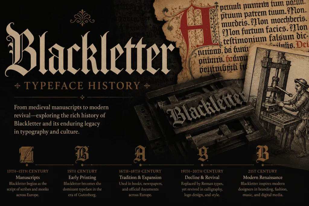
In the 12th century, European scribes gradually compressed the rounder Carolingian handwriting into narrower, more angular letters. Narrow letters fit more words on each page of expensive parchment, and the broad-nibbed pen made the strokes thick, straight and pointed. By the 13th century this "Gothic script" was the standard book hand across much of Europe.
Why it's called blackletter
Pages written this way look dark. The strokes are heavy and close together, leaving little white space, so the text block reads as a dense field of black. English speakers later named the style "blackletter" for exactly that reason.
The "Gothic" insult
Italian Renaissance humanists preferred the rounder letters they believed were classical, and they dismissed the northern style as "Gothic", meaning barbaric, after the Goths who had sacked Rome. The insult stuck and became the neutral name we use today.
Gutenberg and the printed page
When Johannes Gutenberg developed movable-type printing in Mainz around 1440, he copied the book hand readers already trusted. His famous Bible, completed in the mid-1450s, was set in Textura, the tallest and most formal blackletter. Early printers across Germany and much of Europe followed his lead.
Germany holds on
Italy, France and England moved to roman type during the 16th century, but German-speaking countries kept blackletter, especially the Fraktur style, for centuries. It became tied to national identity. The Nazi regime first promoted Fraktur, then in January 1941 abruptly banned it, declaring it "Jewish" letters (a false claim) and ordering roman type, largely so publications could be read in occupied countries. After the war, blackletter's association with that era kept it out of everyday German use.
Blackletter in America
American newspapers adopted blackletter mastheads in the 19th century to signal tradition and authority. The New York Times and many other papers still use one today. The same "Old English" lettering appears on diplomas, certificates and legal documents for the same reason.
Blackletter goes underground
From the 1970s and 80s, heavy metal bands took blackletter for its dark, medieval feel. Chicano lettering artists and tattoo culture developed their own Old English traditions, and in the 1990s West Coast hip-hop made it a streetwear staple. Today it moves freely between luxury fashion logos, beer labels and band merch.
The four main blackletter styles
| Style | Look | Where it was used |
|---|---|---|
| Textura | Tall, narrow, very angular; letters look "woven" | Northern European manuscripts; the Gutenberg Bible |
| Rotunda | Rounder and more open | Italy and Spain, where the angular forms never fully caught on |
| Schwabacher | Rounder, more informal, with distinctive curves | German printing in the 15th and 16th centuries |
| Fraktur | "Broken" curves with sharp angles; elegant capitals | Germany's everyday type from the 16th century until 1941 |
The Unicode "fraktur" letters you can copy from a font generator (𝔉𝔯𝔞𝔨𝔱𝔲𝔯) are named after the last style, although they were added to Unicode for mathematics, where fraktur letters are used as symbols.
How to use gothic blackletter today
- Online: copy Unicode fraktur (𝔊𝔬𝔱𝔥𝔦𝔠) or bold fraktur (𝕲𝖔𝖙𝖍𝖎𝖈) from the generator for bios and captions. Add ☠ or † with the creepy text generator for a darker look.
- In design: use a real blackletter font such as UnifrakturMaguntia or Pirata One (both free on Google Fonts) so it prints correctly.
- Readability: blackletter is hard to read in long passages. Keep it to names, titles and short phrases, and avoid all capitals, which are especially hard to read.
Frequently asked questions
Is blackletter the same as Old English?
"Old English" is a popular name for blackletter type, especially in the US. It has nothing to do with the Old English language; it just means "old-fashioned English lettering".
What are the main blackletter styles?
Historians usually group them into Textura, Rotunda, Schwabacher and Fraktur. Textura is the tall, narrow style of the Gutenberg Bible; Fraktur became Germany's everyday type.
Can I type blackletter on Instagram?
Yes. Unicode includes "fraktur" letters (𝔊𝔬𝔱𝔥𝔦𝔠) and bold fraktur (𝕲𝖔𝖙𝖍𝖎𝖈) that you can copy from the generator and paste into bios and captions.